Now that Adobe® Photoshop® Lightroom® 4 has recently been released I felt that I had to update my little guide on how I develop my "Dubai Cityscapes at Night" pictures. I will explain most of the steps of my workflow in detail. Please note that the following guide describes a worflow that I personally feel happy with - it is by no means the only possible way to develop RAW files. All roads lead to Rome, as the saying goes. It is also possible to carry out most of the steps described below with tools other than Lightroom. "Camera Raw", a Photoshop application, eventually offers just the same functionality.
What is Lightroom 4
Adobe® Photoshop® Lightroom® 4 is a powerful software to develop and manage your photographs. It offers sophisticated color and exposure controls and allows you to professionally develop your RAW images in a well-arranged environment. The software consists of seven modules:
Library,
Develop,
Map, Book, Slideshow,
Print and
Web. In the following I will focus on the
Develop module.
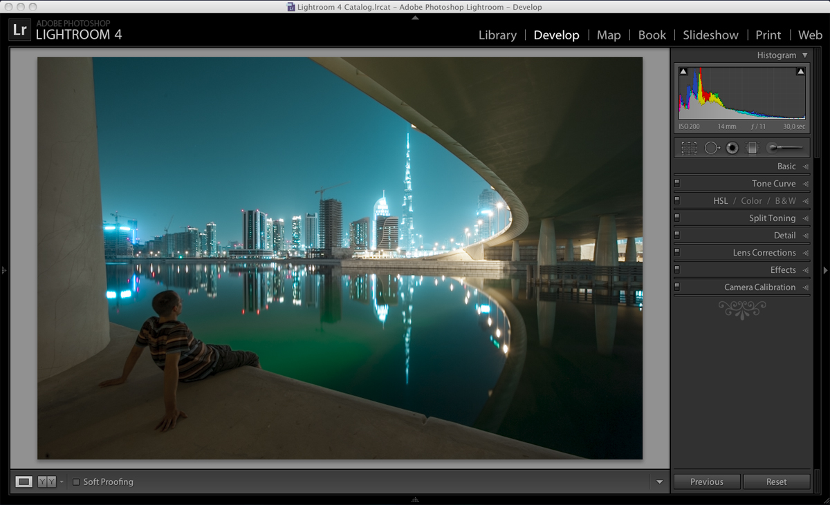
Screenshot of the Develop module in Lightroom 4
Develop Module
A very good thing about Lightroom is that it is
non-destructive, meaning your original photograph is not altered. Your edits are continuously and automatically stored as a set of instructions. Saving in a traditional sense is not required.
You can make adjustments to your photograph in any order, but usually it is best to start with
Basic at the top and work down through
Tone Curve,
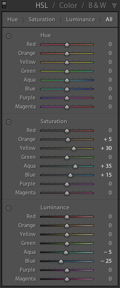
HSL / Color / B&W,
Split Toning,
Detail,
Lens Corrections and
Effects (see above image). I personally only use the
Basic panel, the
HSL panel, and sometimes
Split Toning in Lightroom and then do the rest in Photoshop.
As mentioned above, if you own Photoshop CS5 you will not find anything in Lightroom that could not be done with Photoshop. I just very much prefer the functionality of Lightroom for developing RAW files (instead of using
Camera Raw in Photoshop). And I like that it automatically keeps track of my changes in the library without having to worry about saving and possibly destroying any original data.
Global Color Adjustments
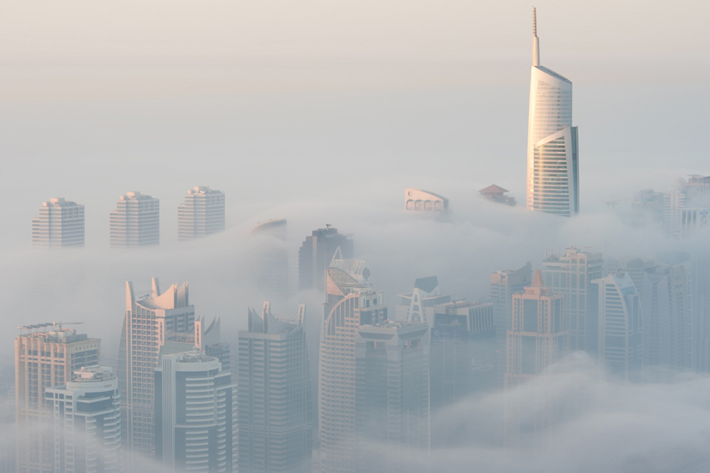
So let's begin with the workflow. Below is an image for which I decided to work a bit more on the
HSL panel than I usually would (see final result at the end of this guide). I chose this picture as an example, because it will be rather easy for you to follow the changes in its appearance. This is what it looked like when I first opened the image in Lightroom 4 - I had set the camera on automatic white balance:
ISO 200, 14mm, f11, 30s, 3050K, Tint -15
I recommend warmly to shoot all your photographs in
RAW format so you later have the freedom to edit them as you wish. One of the major benefits of the RAW format is that it allows you to adjust the white balance / color temperature of your picture comfortably back home in your "Lightroom" as if you were changing a setting in the camera during capture. This is crucial for architectural night photography! You could, of course, set your preferred color temperature during the shoot, but I prefer doing this later.
After defining the visually most appealing white balance setting you can proceed with adjusting the overall tonal scale. However, sometimes I revise the white balance settings after having adjusted the tonal scale. I recommend seeing the complete workflow in Lightroom as an iterative procedure getting ever closer to the "perfect look" of your photograph. Going down the panels and sliders from top to bottom is just a starting point.
1. Set the White Balance
The white balance adjustments are part of the
Basic panel and should be made first. It is best to come back later and fine-tune it. This is what the
Basic panel in Lightroom 4 looks like for this image when you first open it:
The Basic panel in Lightroom 4
As you will see below, I have lowered the color temperature from 3050K to 2300K and I've raised the Tint from -15 to -10, in order to give the overall image a cooler, more blueish look. Fine-tuning the white balance, especially that of night photographs with
different artificial lights, is not only great fun, but will often lead
to stunning results! Do this "right" and the rest of the work editing
your picture will be a minor matter. But whatever you decide is the most appropriate color temperature - avoid pushing any of the sliders too far in either direction.
Temp
This refers to the color temperature of your photograph in Kelvin. If you need a scientific in-depth explanation what this is all about then kindly refer to
Wikipedia. I just know the basics and how to move the slider in Lightroom. The only thing that matters in the end is the visual impact of your image! Just move the slider and you will see the effects. Slide it to the left and your image will look more blueish, slide it to the right and it will become more reddish. Simple as that. For architectural night photography I usually apply a color temperature of something between 2300K and 3500K, depending on the surrounding lights.
Tint
This slider is meant to compensate for a green or magenta tint of your photograph. Move the slider to the left to add green, or move it to the right to add magenta to your picture. In architectural night photography I often add some magenta. However, this largely depends on the individual image and its ambient light. Sometimes I decide on a tint of -10, sometimes I end up with as much as +30.
This is the image after the adjustments in color temperature and tint:
3050K ➡ 2300K, Tint -15 ➡ Tint -10
Just by changing the white balance the image has already significantly changed its appearance. The Blues and the Greens are too saturated for my liking, but I will adjust this later in the
HSL Panel. First, I will now work on the tonal scale.
2. Adjust Overall Tonal Scale
Night photography usually demands for significant adjustments of the overall tonal scale. Bright street lights tend to overexpose the respective parts of an image while the abundant shadows threaten to drown an image in featureless variations of black. Nowadays many people turn to
HDR (High Dynamic Range) Photography for dealing with this problem, but in my opinion this technique has major flaws. And from my experience a single RAW exposure can very well be adjusted as it is with satisfying results.
These are the settings involved in getting a well-balanced picture:
Exposure
You can actually alter the overall exposure of your photograph to a certain extent without losing image quality. I only touch this slider carefully for general rescue if I have messed up a little while capturing the photograph so that it is fully overexposed or underexposed.
Contrast
This slider decreases or increases image
contrast, mainly affecting midtones. Moving the slider to the right
darkens the middle-to-dark areas of the image while it lightens the
middle-to-light areas. Moving the slider to the left decreases image
contrast by the inverse effect on these image areas.
Highlights
Use this slider to reduce the tones of moderate highlights and to recover highlight detail. In order to recover overexposed areas such as street lights I commonly move this slider to the left. However, it can also be used for emphasizing the glow of city lights by sliding it to the right. But I personally prefer controlling this with the
Luminance sliders in the
HSL Panel (see below).
Shadows
When you move this slider to the right it will lighten shadows to reveal detail while maintaining blacks. But be careful! If you overdo this setting it might reveal image noise.
Whites
Use this slider to reduce the tones of
extreme highlights. I use this slider for highlight recovery only very cautiously, as it tends to take the clear white finishing crisp from an image.
Blacks
Moving the slider
to the left increases the value of extremely dark areas, sometimes creating
the impression of increased image contrast. The greatest effect
is in the shadows, with much less change in the midtones and highlights. Be careful with this slider and constantly check the details of dark areas for noise and tonal breaks.
3. Overall Color Saturation
Adjusting the color saturation gives your photograph a more vibrant look and adds to its visual depth. But once again, be careful not to over apply the following settings.
Clarity
This slider allows you to add depth to your photograph by increasing local contrast. It is best to zoom in to 100% or greater to judge on the effect.
To maximize it, increase the setting until you see halos
near the edge details of the image, and then reduce the setting
slightly. I usually apply a value between 0 and +30 to my night pictures.
Vibrance
This is a great tool for literally adding vibrance to the colors of your image. It is somewhat "intelligent" enough not to overdo certain tones and offers great possibilities to pimp your image. But again, don't go crazy.
Saturation
Adjusts the saturation of all image colors equally from
–100 (monochrome) to +100 (double the saturation). Instead of using this slider, I recommend using
Hue,
Saturation and
Luminance (HSL) for each color channel in the
HSL / Color / B&W panel (see below).
The image after finishing all adjustments in the Basic panel
Basic adjustments for the above image
Other Means of Adjusting Color and Tone (HSL, Split Toning)
The image is now over-saturated, for my taste. This can be addressed in the
HSL panel. As I have already mentioned, this panel offers great possibilities to
adjust the hue, the saturation and the luminance for each color channel separately. You can either move the sliders individually or do the following. In the upper-left of each sub-panel you see a little button. Click this button, move the pointer over an area in the
photo that you want to adjust, and then click the mouse. Drag the
pointer to adjust the hue (H), saturation (S) or luminance (L) of that specific color. However, I rarely use dragging the pointer and and adjust each slider manually one by one.
This is what the HSL panel looks like for this image after applying all changes:
HSL panel after adjusting Hue, Saturation and Luminance of different colors
- Note that I have changed the Hue of the Blue channel in order to create a turquoise look. Also I have changed the Hue of the Green channel in order to adjust the green color of the water.
- I have desaturated Yellow and Green, as well as Blue, in order to make the colors pop less, thus giving the image a cleaner appearance.
- Finally, I have increased the luminance of Yellow for adding a little glare to the lights, decreased luminance for Green and slightly increased it for the blue sky.
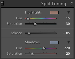
I also recommend checking out the
Split Toning panel. It offers very much a similar functionality, but focuses on color adjustments with regards to highlights and shadows. Sometimes this can be very useful, so keep an eye on it.
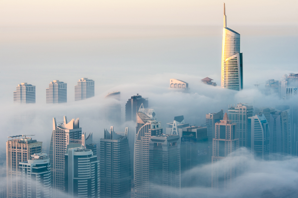
That's it for the workflow of this particular image in Lightroom. From here I export the photo in TIF format to Photoshop CS5. There I remove dust spots, sharpen the image and convert it into sRGB color space before I save it as a JPG.
And this is the final result:
If you have any questions please do not hesitate to ask me. I'll be happy to help.
Further information about my photography and more resources:
Cheers,
Sebastian